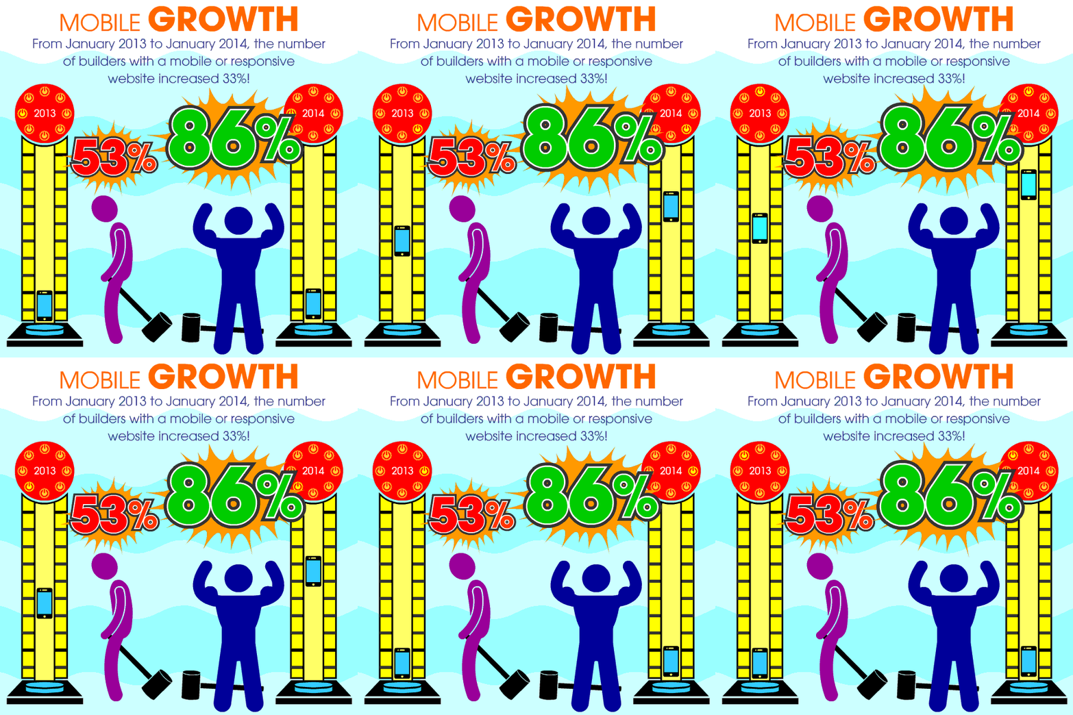
Builders responded to consumers demand for mobile usage in BIG way in 2013, with 86% now reporting having a mobile friendly website, up from 53% just a year ago. Like we stated in the Sales & Marketing Pulse 2013, not having a mobile website now puts you in the minority, and provides a uniquely poor experience for consumers visiting your website. If users have to pinch and zoom their way through your desktop website on their mobile device, they’ll probably be a bit disgruntled once they find what they’re looking for and even more likely, they’ll close out of the web browser before going even one page further.
Going mobile is a relatively affordable upgrade. The company that built your website can most likely create a simple, mobile friendly version. But if you’re in the market for a new website altogether, you may want to do some homework on the concept of Responsive Web Design (RWD). This is the method of building a website that looks good across all devices. Whether it’s a desktop computer with a gigantic flat screen, a laptop, a tablet or a mobile phone, your site is going to look it’s best on all of them if it’s built using responsive principles. Here’s a post we did last year that touches on the Mobile vs. Responsive debate. Or you can read the full article in the Nov/Dec 2013 edtion of Sales & Marketing Ideas Magazine (did we mention our own Dennis O’Neil wrote it?)
For more on mobile, check out this morning’s session The Empowered Client: How Social, Local, and Mobile are Transforming the Way Consumers Build and Renovate from 8-9am in South 223.


